• Work
  • Astrogram
  • About
  • Contact
  • Blog
Astroham Brand
  • Work
  • Astrogram
  • About
  • Contact
  • Blog

Goodtype The Book Volume One

I'm honored to be among some seriously talented folks selected to have their typographic works published in Goodtype's first book. Operated by Brooke Robinson and followed by nearly 700,000 on Instagram, Goodtype is responsible for curating one of the most massive collections of lettering, calligraphy, and typography on social media. As a result, incredible opportunities for inspiration and exposure have been created for us lovers of letters.

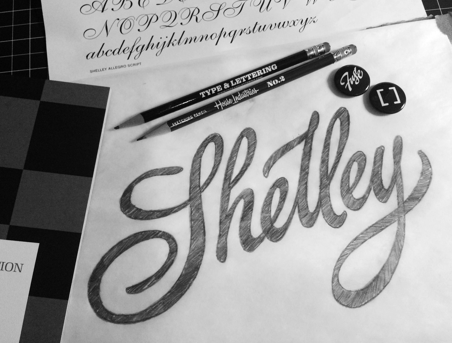
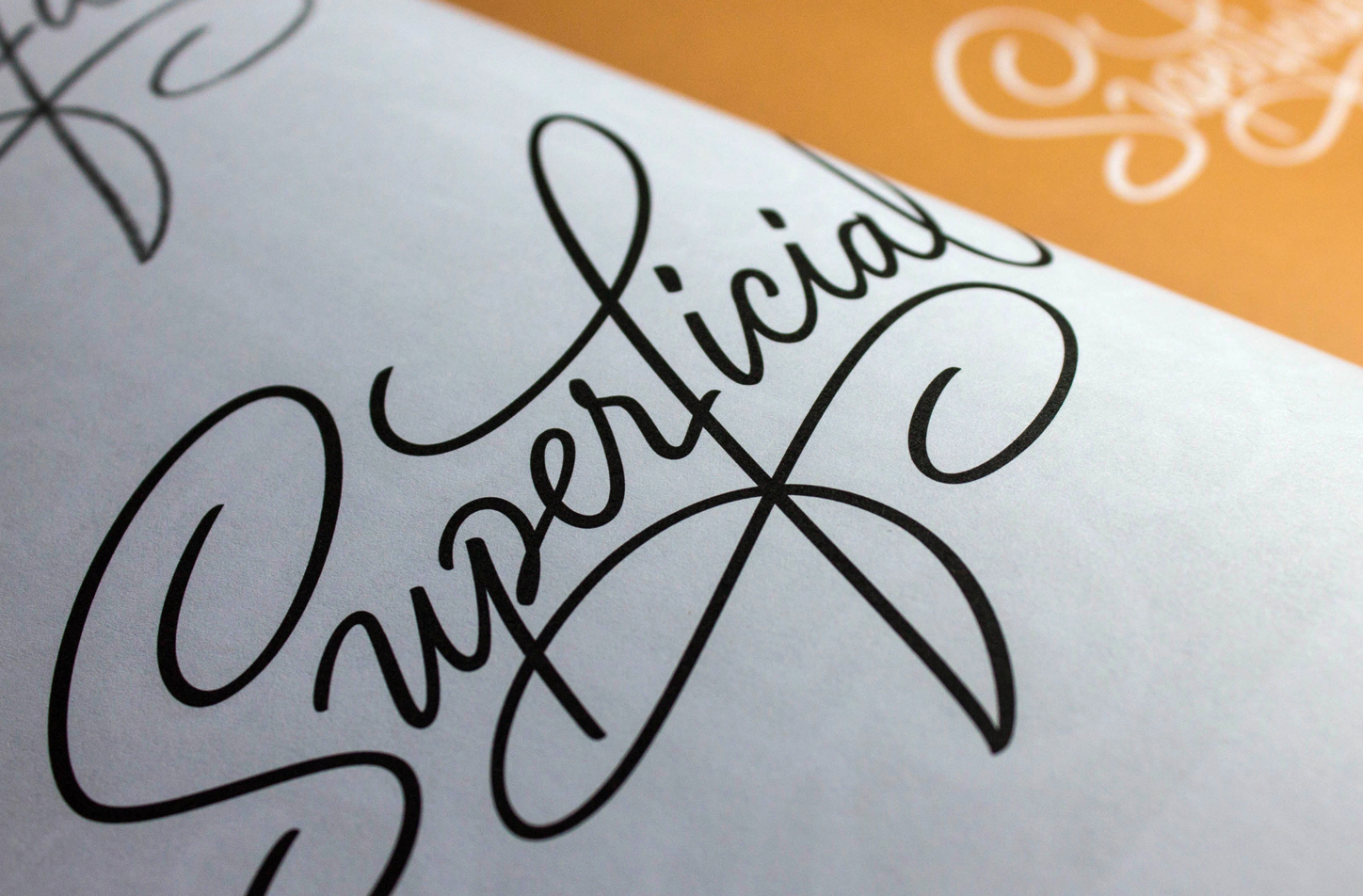
Truth be told, my submission for the Goodtype book was far from conceptual. What began as a mindless doodle during a telephone call, I later considered submitting after noticing the somewhat garish nature of the strokes. I figured "Why not submit a quick little piece whose aesthetic qualities capture the meaning of the word?". That is, after all, why lettering and typography appeal to me so much in the first place.

Funded by a wildly successful Kickstarter campaign and featuring nearly 200 artists worldwide, the Goodtype book is a tactile extension of Goodtype's social feed and has sold over 1200 copies.

I'm grateful for being able to develop a world-wide network of peers and pals in the design and lettering world thanks to the communities built by brands like Goodtype. In fact, I never would have imagined the ways in which my lettering passion and skills would grow because of it. Many thanks go out to Brooke and her team for working tirelessly to feature our work and curate one of the best Instagram feeds on the planet!

Goodtype_blog_head2a.jpg

If you'd like a copy, it may require some patience, but you can get up to date information on when the next run of prints will be made available by clicking here. I promise it will be worth the wait!

Source: http://www.lovegoodtype.com/
Wednesday 11.09.16
Posted by Jason Carter
Comments: 2
 

[fuse] Session 01: Script Lettering with Ken Barber

Element Three is situated inside this spectacular pyramid office structure in Indianapolis, Indiana.

Element Three is situated inside this spectacular pyramid office structure in Indianapolis, Indiana.

Way back in March I had the pleasure of attending the inaugural [fuse] Sessions; a series of intimate, hands-on, creative workshops hosted by the Element Three branding agency in Indianapolis.

Ken Barber, a type designer and letterer at House Industries, rarely makes it to the midwest for his seminars, so I was pumped to head one state over to finally meet some social media pals like the great Bob Ewing and attend my first lettering workshop.

ken_barber1.png

Ken and the Element Three folks really blew me away with this workshop. The day began with a script lettering presentation from Ken, who really knows how to carry a crowd. We focused on formal script in the morning having a chance to try our hand at properly duplicating many of the intricacies involved with building proper roundhand letterforms.

My biggest regret was not shooting a photo of the lunch spread: lots of gourmet pizza.

My biggest regret was not shooting a photo of the lunch spread: lots of gourmet pizza.

 The second half of the day was dedicated to informal lettering, and putting our newfound knowledge to paper once again after Ken illustrated a variety of techniques used for pumping more character into a formal script typeface. We were instructed to choose one of the typefaces in our packet as a guide and letter a word of our choosing.

Ken spent the remainder of the afternoon giving us one on one feedback specific to our piece before we concluded and voted on the works that best executed the lessons of the day.

I attempted to pay close attention to subtle stroke transitions within the Shelley Allegro typeface.

I attempted to pay close attention to subtle stroke transitions within the Shelley Allegro typeface.

Having been taught by and studying from masters like the late Doyald Young, Ken stresses the importance of the historical development of letterforms which is beyond evident in his work, and makes him an indispensable resource to us as lovers of letters. Indeed there are many talented letterers out there sharing their gifts, but a select few exude the same "je ne sais quoi" that is prevalent in a Ken Barber piece.

If you ever have the opportunity to participate in a [fuse] Sessions workshop, you must! Grabbing Ken for their first session was a sign of very big things to come. I learned a lot, I made some hugely talented, creative friends, ate like a king, and left feeling like i made off like a bandit with some cool Type & Lettering swag and a comfy tee.

Follow Ken Barber @typelettering and [fuse] Sessions @fusesessions on Instagram for more information. Seminar photographs courtesy of Element Three.

Monday 08.17.15
Posted by Jason Carter
Comments: 1
 

Cotton Bureau / Game of Thrones tee now available!

Many months back, I brush-penned a foreboding phrase spoken by the Red Woman in the hit HBO Series Game of Thrones. In anticipation for the premiere of Season 5, I revisited the piece, touched it up just a bit and lettered it into something a bit more ominous. Now its available for purchase via Cotton Bureau right here!

The tee is offered in a tri-blend Athletic Grey (pictured above), a super sinister black on Heathered Black and of course in the Lord of Light's personal favorite Heathered Cranberry (perfect for spilling wine...or a little blood).

The last possible second to buy this design is Apr 27, 2015 at 8:00 PM and only goes to print if there are a minimum of 12 purchased so make sure you grab one early over at Cotton Bureau before the fire burns them all away!

Source: https://cottonbureau.com/products/the-nigh...
Monday 04.13.15
Posted by Jason Carter
Comments: 1
 

© 2016 Astroham Brand